Alfred Ibiza
Year: 2021
Role: Creative Director & UX Lead
Brief: Redesign the Alfred Ibiza mobile apps and create a user journey that is intuitive and makes it easy to order food and groceries in Ibiza.
Our aim as the primary rival of UberEats was to differentiate ourselves and establish our app as the premier destination for food and grocery delivery. To achieve this, we concentrated on providing a comprehensive service through Alfred Ibiza, which allows users to order food, book a table, and receive their drinks and snacks within 15 minutes. Given that Ibiza is predominantly known for its nightlife, we tailored our offerings to cater specifically to this demographic. Users can easily locate restaurants with available seating for a fun night out, order from the finest local restaurants, or order any necessary items to remedy a hangover for the following day.
YOU CLICK. WE DELIVER
YOU CLICK. WE DELIVER
The challenge of designing the one-stop-shop of Ibiza
Developing an all-in-one app that surpasses UberEats is no easy feat. We tackled this challenge by creating three distinct apps, each designed to cater to a different user group: one for restaurants, one for riders, and one for customers. Each app is tailored to provide the best possible service to its intended audience. In this case study I will only highlight the process of the customers app.
The restaurant admin app is designed with a clear, concise interface in mind. This allows restaurant staff to effortlessly add menu items, schedule breaks, pause orders during busy periods, and communicate with riders and customers.
The rider app prioritizes safety and simplicity, with a user-friendly interface that is easy to navigate while on the road.
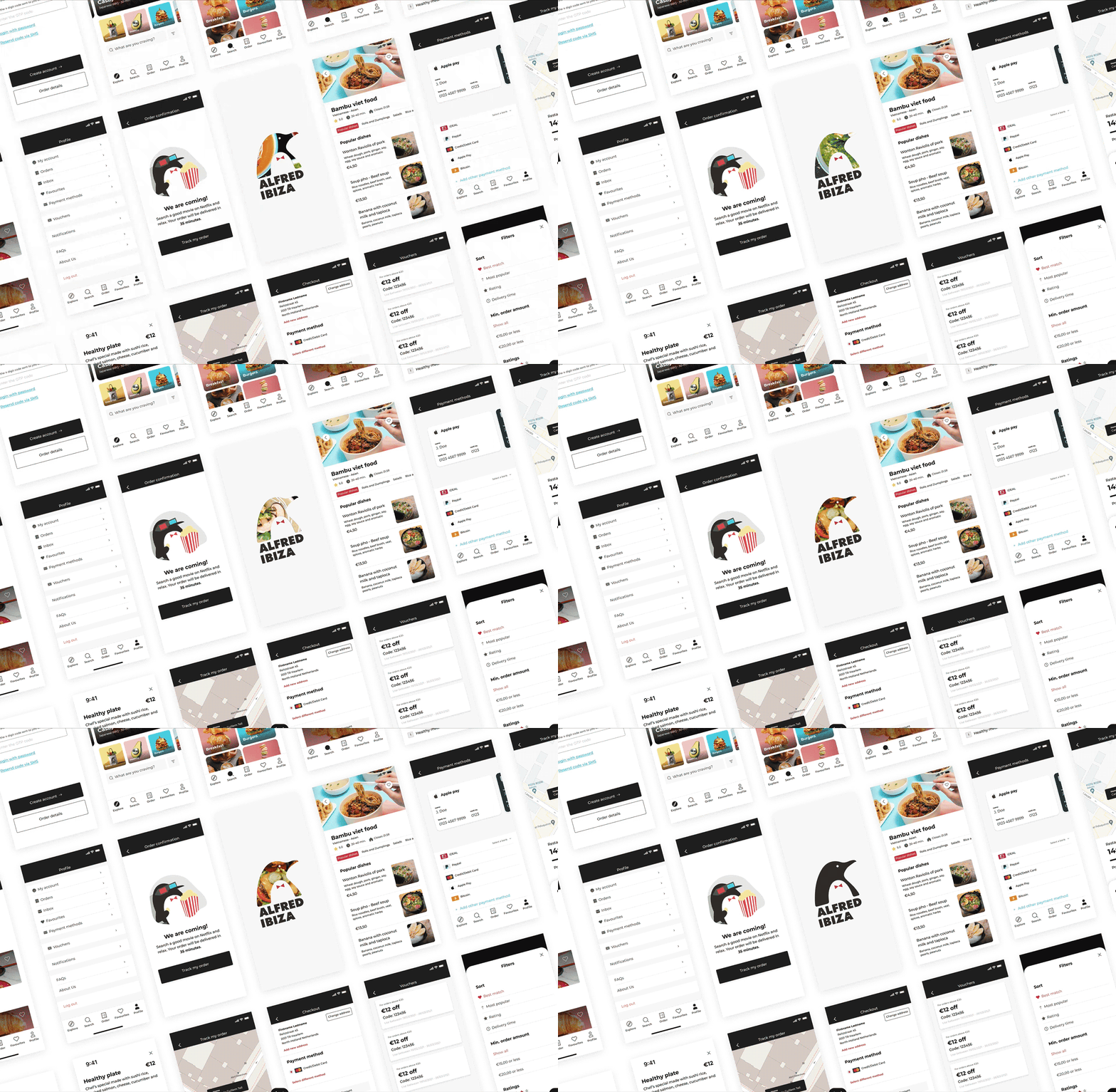
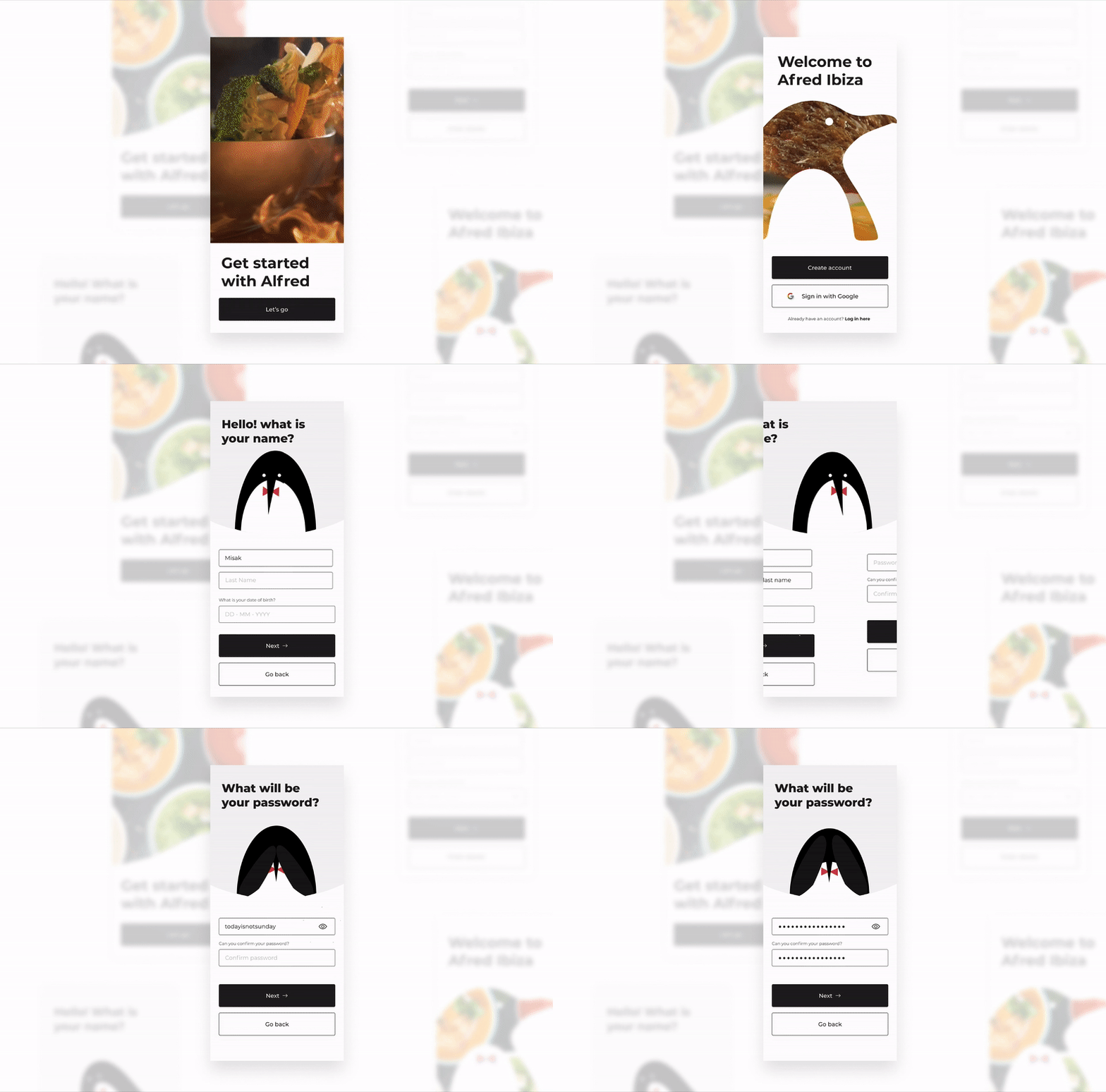
The customer app focuses on providing a seamless experience, allowing users to switch effortlessly between browsing restaurants and ordering groceries with ease.
Planning and scope of the project
Our objective was to launch a minimum viable product (MVP) for Alfred Ibiza before the peak season months in Ibiza. This necessitated close collaboration with the Alfred Ibiza team in London to create a focused and well-planned strategy. As the UX lead, I had the assistance of two exceptional UX designers, Misaki Saraya and San San Nguyen. We divided the project into three phases, with the initial focus on the consumer app, followed by the rider and provider app, and finally, the grocery feature. At the end of each phase, we provided two weeks of post-care support to ensure that the design was seamlessly integrated with the development team's efforts.
Understanding the customer journey
Our initial step in conducting field research was to gain an understanding of the current market and the users of the existing app. Our goal was to identify the challenges and pain points experienced by users. First we analysed the existing app and gather information by conducting qualitative user testing which included interviews and card sorting exercises. Gathering this information enabled us to create a well-defined customer journey, outlining the steps taken by users from start to finish. This allowed us to identify the issues that needed to be addressed, and we were then able to move on to the fun part: Ideation!
Ideation phase:
Time to get messy!
By having three designers, we can leverage our collective creativity to generate a plethora of ideas and concepts. We utilized a technique known as Crazy Eight, which involves folding an A4 paper three times to create eight small boxes. The purpose of this exercise is to diverge and think beyond conventional boundaries. Each of us had 30 seconds to jot down an idea, feature, or design in one of the boxes before passing the paper to the next person. In just four minutes, we were able to produce 24 unique concepts through this exercise.
Bringing it all back together to create prototypes
Following the divergent phase, it is now time for convergence, where all elements come together. We crafted low and high fidelity wireframes, which we then presented to the stakeholders in Ibiza for their input. Subsequently, we developed clickable prototypes using Figma, and tested them with actual users, utilizing both quantitative (A/B) and qualitative testing (interviews) methods to authenticate our designs.
Handing off a complete component library to the development team
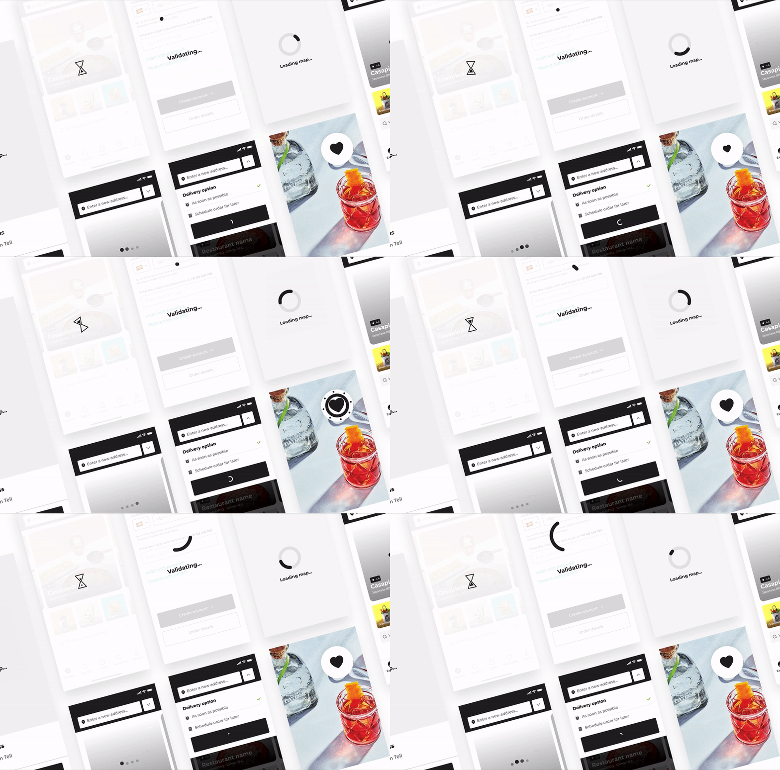
In the realm of application design, the handoff stage is as crucial as the design phase itself. Throughout the process, we meticulously documented and amassed all designs as components, keeping development in mind. During the handoff period, we provided guidance and support on their Slack channel for minor tweaks and seamless implementation, which enabled the client to wrap up the project quickly. The collaboration was highly successful, prompting us to continue designing fresh features even after the app's launch.
Results and learnings:
We put out amazing numbers for Alfred Ibiza in just 3 months!
The design thinking method works in every scale, big or small, fast or slow. Be sure to converge and diverge, get messy and clean up.
Really listen to the user by testing up front. We spent a day just on the phone with local people, restaurants, riders and tourists to better understand their needs before we created this app.


